Mountain Lion Skull (Watercolor on
San Diego CityBeat newsprint)
California Condor Skull (Watercolor on
San Diego CityBeat newsprint).
Sometimes painting can feel like a combination of calculus and digging a ditch: a methodical grind. This feels like neither. It’s spontaneous, intuitive, and relaxed. There’s something about this combination of paper, medium, and subject matter that has led to some of the most fun I’ve had painting. There's an experimental immediacy to the process, and I like the results.
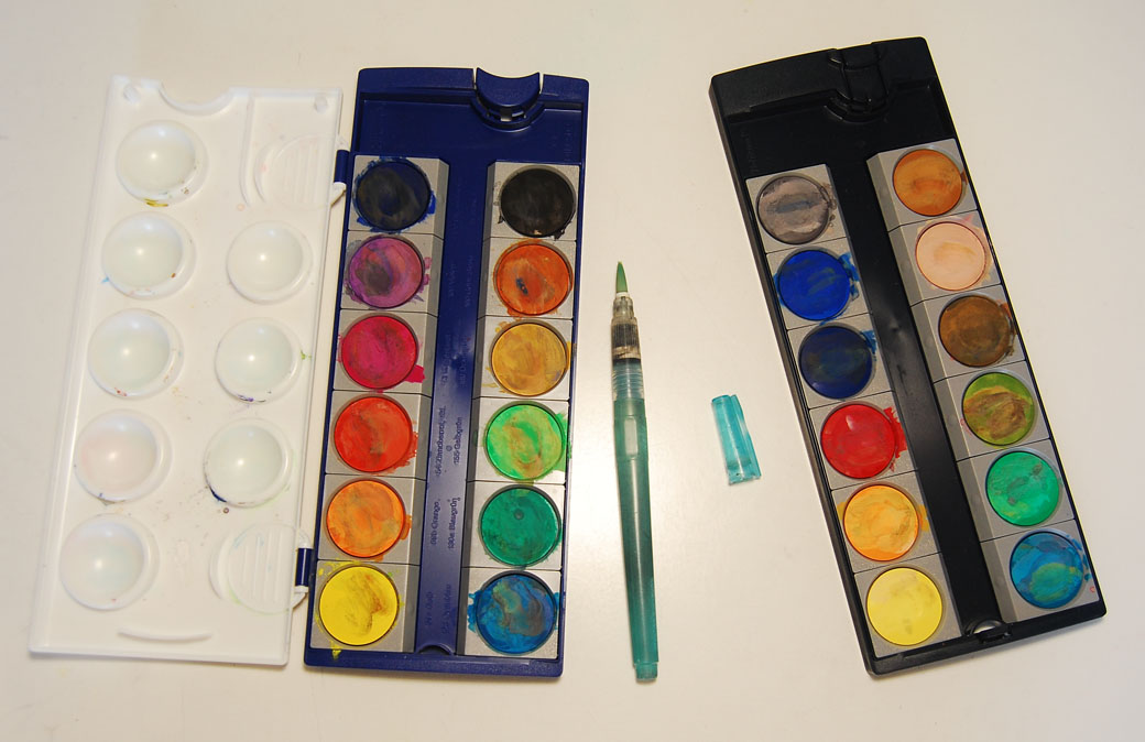
The Pelikan opaque watercolor set has revolutionized my technique when using paper that’s non-conducive to water media. It produces rich colors without the need for much water. I use a waterbrush due to its self-contained efficiency. Because I don’t carry a water basin to fully rinse out my brush, color cross-contamination occurs, but I don’t mind that. My set-up promotes quick, reactive work and creates interesting mixtures. If I need a pure color it’s easy enough to remove the top dirty layer and get a clean pigment. Here’s a picture of my set-up:
A friend recently asked me a perfectly reasonable question: “Why so many skulls?”
From a technical standpoint, there are many reasons. Skulls offer a dynamic range of shapes, contours, and edges. They require a heavy amount of design to make them look cool. In order to understand an animal’s outward appearance, it’s helpful to understand the structure underneath. I also recently visited the San Diego Natural History Museum’s Skulls exhibit and have an abundance of original photo reference I can work from. Drawing skulls becomes its own form of art school -- I learn a lot in the process.
From a personal standpoint… that’s more difficult to answer and something I’ve been thinking about a lot. Five years ago, I would have found the act of drawing skulls to be a morbid activity. But over time I’ve acclimated to their visual impact and consider them somewhat benign objects -- no different than a vase or a bowl of fruit -- if the bowl of fruit was really, really cool looking.
I’m often not aware of symbolic repetition in my artwork until hindsight, time, and distance provide me perspective. I remember going through drawings I did ten years ago and realized that I had drawn all of these structures that had no foundation. I drew the top part of the Eiffel Tower and it had no base. Trees had no trunks. They all just floated without attachment. Did this thread say something about the state of my life at that time? It’s difficult to tell but I find it an interesting question to pose. I noticed that a few years later I had drawn a considerable number of doorways and entrances. Again, how to know what it means?
I'm at an age where death enters my mind with some frequency and I feel vulnerable. Wills are drawn up. Classmates have died. My beloved aunt succumbed to cancer a few years ago. I was updating my address book last week and when I saw her name I became instantly filled with sadness. I'm out of shape. I have an aging and very sweet cat that has her share of problems and I worry about her. Is drawing skulls a coping mechanism that demystifies death? Would I draw fewer if I was in better shape?
It's hard to determine why a visual thread appears in my work and then disappears. To what extent is the selection based on purely technical reasons or emotional? It could mean nothing. It could mean everything.
And in ten years I’ll look back at this time and wonder.