

Tuesday, December 30, 2014
Tuesday, December 16, 2014
Sketchbook: Kate In Purple Dress On Green Chair.
Kate in Purple Dress on Green Chair (Pen and watercolor on tan sketchbook paper, 7x9").

Sketchbook: Julie.
I constantly experiment with various mediums and materials. Every once in a while they line up in a way where I enjoy exploring their potential. Right now that combination is the unforgiving combination of ballpoint pen and watercolor on thin, tan sketchbook paper.
Julie (Pen and watercolor on tan sketchbook paper, 7x11").

Julie (Pen and watercolor on tan sketchbook paper, 7x11").
Monday, December 08, 2014

Wednesday, November 26, 2014
Art Of The Zodiac Art Show.
I had a great time participating in last night's "Art of the Zodiac" show held for one night only at Bar Basic downtown and curated by Thumbprint Gallery.


I had three pieces in the exhibit:
Lion Skull (Leo). Ballpoint pen and watercolor on paper. 6.5x4.5"
Ram Skull (Aries). Ballpoint pen and watercolor on paper mounted on wood. 8x6"
The Maiden (Virgo). Watercolor and pencil on paper mounted on wood.7x8"
Monday, November 17, 2014
Sketchbook: Giraffe Skull With Leaf Print
Giraffe Skull With Leaf Print (Ballpoint pen with acrylic leaf print in Moleskine sketchbook, 8x5").

Saturday, October 18, 2014
Art: Sketches On Backs Of Wine Labels.
Over a dozen years ago, I went wine tasting in Temecula and in a winery gift shop I came across a stack of wine labels bound together on one side and picked them up -- thinking it would make an interesting notepad to have on my desk. They sat unused until just recently, when I grabbed it to start taking notes. After jotting down some numbers, I did a pen sketch of Samantha, and noticed that the paper responded really well to ink.

And thus began a series of sketches on the backs of wine labels....
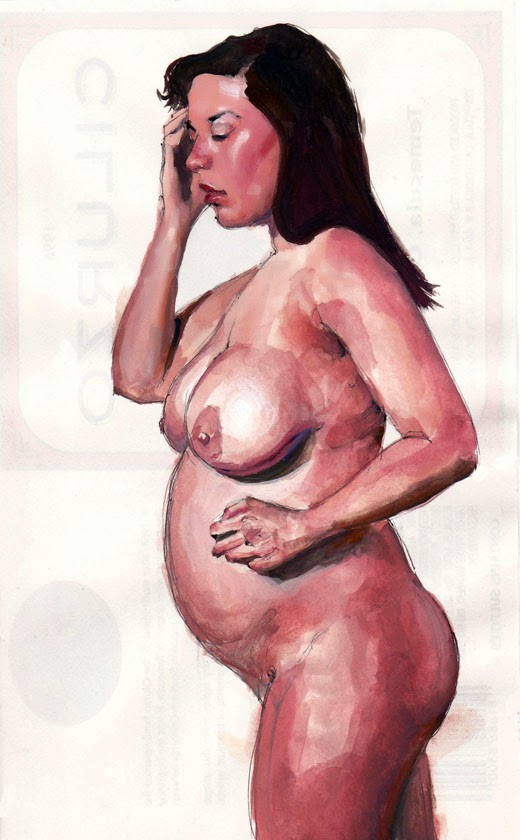


And thus began a series of sketches on the backs of wine labels....
Friday, September 05, 2014
Art For Sale At Twiggs On Adams.
During September and October, I'll have 15 pieces of artwork for sale at Twiggs Coffee Shop on Adams Avenue (San Diego). I've included an eclectic mix of pieces. I have my four most recent oil portraits among my decade old Meerkat painting and 2006/2007 lino-cut block prints. And there are various mediums represented including oil, ink, prints, and watercolors. Stop in, get some tasty food and drink, and take a gander at my work.


Sunday, July 27, 2014
Art: Portrait Of Julie With Blue Background.
Portrait of Julie with Blue Background (Oil on canvas board, 9x12").


Here are some process shots.
Sunday, July 13, 2014
Art: Thoughts, In Shadow.
Thoughts, In Shadow (Oil on canvas board, 9x12").

In my reference photo, the model had the majority of her face in shadow and I thought it would be an interesting challenge to render the shapes. I ended up creating a lost edge between her face and the hair, but found that creating a small temperature difference (warm in the face and cold in the shadows) provided enough information to get the features to read better. I then played with the hair and background -- pushing and pulling each -- until I found a balance that I felt was effective in creating a mood.
Here are a few progress shots. The outline was painted with a combination of red oxide, ultramarine blue, and alizarin crimson. In the second shot, I had the face more rendered than the final painting, but found it distracting, and ended up scumbling it out to create a lost edge with minimal detail.
Sunday, July 06, 2014
Painterly Observations From The Sorolla Show.
The Joaquin Sorolla exhibit at the San Diego Museum of Art is one of the best single-artist shows I've ever seen. Mind-blowing. I've been four times and plan on going more until it disappears in a scant two months. I highly recommend seeing the show if you get a chance.

I learn a tremendous amount from observing the work in these shows, and am always curious which elements get absorbed and infused back into my own work. Thus far I've done three small pencil studies in a Moleskine sketchbook.


Here are some observations of Sorolla and the show from a painter’s perspective.
- Intriguing Portrait Compositions.
When painting portraits, the convention is for the figure to occupy the full frame of the canvas. Interestingly, Sorolla broke this convention in several pieces by placing heads near the center of the canvas, leaving the figure enveloped by a large portion of the background.


The portraits are effective and charming, but what was it about these men where Sorolla thought their portrait would be better served by having them surrounded by so much background? Was there something meek about their personality? Which leads to one of the more curious placements... that of President William Howard Taft....

If you want a person to appear authoritative and important, you paint them filling the frame, possibly even overflowing it. You may angle the perspective to look up at the person. Which is why it's fascinating to see the robust Taft appear diminished. What was Sorolla's intent in having so much background hover above, in effect, surrounding and suppressing the figure? Especially considering that he was painting the sitting President of the United States. One would think that his composition would evoke power. The President's direct gaze and smile make him appear casual and gregarious. Was Sorolla trying to add some humanity and approach-ability to how Taft would be perceived? Compare this work to one painted by Anders Zorn with Taft in almost the exact same position.... but the President fills the frame and directs his gaze off-center.


Compare that to how the artist, Michael C Hayes, treats drapery. Michael heavily renders fabric to enhance the look, intrigue, and drama of his pieces.


I learn a tremendous amount from observing the work in these shows, and am always curious which elements get absorbed and infused back into my own work. Thus far I've done three small pencil studies in a Moleskine sketchbook.
Here are some observations of Sorolla and the show from a painter’s perspective.
- Intriguing Portrait Compositions.
When painting portraits, the convention is for the figure to occupy the full frame of the canvas. Interestingly, Sorolla broke this convention in several pieces by placing heads near the center of the canvas, leaving the figure enveloped by a large portion of the background.
Joaquin Sorolla, Portrait of Ralph Clarkson, 1911.
Joaquin Sorolla, Portrait of Charles M Kurtz, 1909.
The portraits are effective and charming, but what was it about these men where Sorolla thought their portrait would be better served by having them surrounded by so much background? Was there something meek about their personality? Which leads to one of the more curious placements... that of President William Howard Taft....
Joaquin Sorolla, Portrait of William Howard Taft, 1909.
If you want a person to appear authoritative and important, you paint them filling the frame, possibly even overflowing it. You may angle the perspective to look up at the person. Which is why it's fascinating to see the robust Taft appear diminished. What was Sorolla's intent in having so much background hover above, in effect, surrounding and suppressing the figure? Especially considering that he was painting the sitting President of the United States. One would think that his composition would evoke power. The President's direct gaze and smile make him appear casual and gregarious. Was Sorolla trying to add some humanity and approach-ability to how Taft would be perceived? Compare this work to one painted by Anders Zorn with Taft in almost the exact same position.... but the President fills the frame and directs his gaze off-center.
Anders Zorn, President Taft.
- He dictates what's important.
Try to look at anything other than his wife's eyes....
Joaquin Sorolla, Clotilde Seated on a Sofa, 1910.
Sorolla has wonderful skill in directing the viewer's gaze. He does this with a few techniques. First, he relies on contrast. Viewer's eyes immediately seek out areas of high contrast. By framing her face with dark background and hair on top, and surrounding it underneath with the bright dress and sofa, he drives focus to her dark eyes. Secondly, he makes sure nothing competes with her eyes. The sofa is a muted yellow color. Her lips are desaturated and light in value -- he didn't give her ruby red lips which would cause the viewer to fluctuate between her lips and eyes. I was told by an art instructor: "You got to choose between promoting the lips or the eyes. Otherwise they compete and neither of them look remarkable."
Sorolla lets you know what's important.
Wandering through the exhibit, I constantly observed how he placed light objects against dark to create contrast. In his painting, Senora de Sorolla, his wife's features radiate when juxtaposed against the black dress. It may be my favorite painting in the show.
Joaquin Sorolla, Senora de Sorolla, 1906.
And if he doesn't want you to care about an object, he makes sure you don't by not painting it. Take a look at Taft's left hand in the painting:
While you can tell it's a hand, it lacks definition and detail -- almost to the point of looking unfinished. It remains abstract because he doesn't want that to be your point of focus. Look at the other hand at the same height. He wants you to look at the fist. It has detail and is surrounded by dark shadows to promote contrast. Value wise, the hands don't vary much. Detail wise, they're treated differently. A quick aside, look at the stroke of red underneath his pointer finger on his right hand. He's the master at reflected light. It makes a large difference in how that hand is perceived.
To emphasize the face and features, he de-emphasized clothing by painting the folds and drapery with flat strokes using only two or three values. He didn't want them to compete with more important elements. The clothes aren't busy. He insinuated folds without heavy rendering. He does a dark stroke, a light stroke, and a medium value to blend. If you squint, clothing appears to be composed of two values. It could be rendered in black and white.
In his self-portrait, observe how he renders the folds of his jacket with broad, simple strokes.
Compare that to how the artist, Michael C Hayes, treats drapery. Michael heavily renders fabric to enhance the look, intrigue, and drama of his pieces.
Michael C Hayes, Death of Arthur.
- The Elusive Jawline
Jaw lines -- particularly on females -- are difficult to paint. There's little room for error since a bad shape will change a person's identity and too strong a line can give a female a masculine quality. I noticed on Sorolla's paintings of women that he painted their jaw lines with very soft edges and a constant value. He would then add a single tiny straight dark line across one part to demarcate the change in form. Very effective. I used this technique on my recent painting of Samantha.
Bryan Tipton, Portrait of Samantha III (Close-up). 2014.
- Affection
Two of my favorite paintings in the exhibit are those of his wife, Clotilde.
Joaquin Sorolla, Senora de Sorolla, 1906.
Joaquin Sorolla, Clotilde Seated on a Sofa, 1910.
Looking at these paintings, I sensed that Sorolla had strong affection for his wife by the way he portrayed her. He captures her presence. And I like how she gazes back at him with a look of, "I love you and I'll hold still... but I kind of want this to be over."
- The Hazards of Green
Green -- especially Viridian or Pthalo -- is a dangerous color to use in flesh tones as it can look out of place or make a person appear sickly. However, Sorolla used it beautifully in some of the mid-tone transitions when he painted people in ocean scenes. It created color harmonies between the people and the water. Look for strokes of green in his flesh tones when he transitions from dark to light values in his sea-based figures.
- Show Lighting
My only criticism of an otherwise incredible show is the lighting. Each painting has a direct spotlight focused on it and due to the light's angle and heavy lacquer on the work, the reflection off the paintings is so strong that it's nearly impossible to view the painting when standing in front of it at a medium to close depth. To see any detail you have to stand to the side which makes viewing the paintings awkward. I'm not sure how to solve it except for changing the angle of the lights or adding diffusion.
- Book
The book, Sorolla and America, is a great companion to the show. The reproductions are true and all the paintings are in there. But there's nothing like seeing these paintings in person.
- Favorite Paintings
My five favorite paintings in the exhibit are:
- Senora de Sorolla
- Clotilde Seated on a Sofa
- Chandler Robbins
- The Peppers
- The Blind Man of Toledo
Sunday, June 29, 2014
Art: Portrait of Samantha III.
Portrait of Samantha III (Oil on canvas board, 9x12").

A few close-up views:


Over my studies, it took me a while to realize how desaturated flesh colors really were. I used complementary colors and Gamblin's Radiant Blue to grey-down colors and preserve the quality of the mixtures.
It has been a while since I've painted a portrait. I was pleased with how this turned out and surprised myself a bit. It feels "painterly," which is a quality I love.
Here are a few process shots. I drew the outline in a mixture of red oxide, alizarin crimson, and ultramarine blue.


A few close-up views:
Over my studies, it took me a while to realize how desaturated flesh colors really were. I used complementary colors and Gamblin's Radiant Blue to grey-down colors and preserve the quality of the mixtures.
It has been a while since I've painted a portrait. I was pleased with how this turned out and surprised myself a bit. It feels "painterly," which is a quality I love.
Here are a few process shots. I drew the outline in a mixture of red oxide, alizarin crimson, and ultramarine blue.
Subscribe to:
Posts (Atom)
