

Monday, January 30, 2012
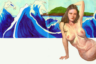
Sketchbook: Tamara With Waves.
Tamara With Waves (Watercolor and acrylic ink in Moleskine sketchbook, 10x7").
Sunday, January 29, 2012
The Allure Of Charm.
Sketch comedy is tough -- making strangers laugh instantaneously with a new premise in a short window of time. It’s often hit or miss. Risks are taken that don’t pan out. Other sketches become part of the national lexicon (think SNL in the late 80s). The difficultly level is high.
I enjoy the sketch TV series, Portlandia. It possesses an earnestness and charm that I find endearing, and these qualities enable me to overlook the occasional flat premise or sketch. It has a tongue-in-cheek sincerity. It comes from a good place. It makes me happy.
I know that “charming” can be an abstract and subjective value, perhaps even trite, but it carries weight with me. It injects a scene with personality and adds color. I engage with the material.
If something is perfect, you rarely speak about its charm. I think that charm accompanies something flawed. You can always pose the question, “Does it have enough charm to overlook the flaws?” That’s the tipping point. This applies to TV shows, pieces of art, and even when choosing who to date. How often has someone ignored a person’s flaws because they found he/she charming? The allure of the charming bad-boy is legendary. The charm-flawed object produces a more interesting riddle than something perfect (and perhaps predictable). How often have we been won over by the charming pet with scraggly fur?
I have never felt engaged by a photo-realistic painting of a fruit basket. Others love it. Not me. Too perfect.
I’m taking a portrait painting class this term and wanted to practice specific disciplines between classes. I’d like to paint looser and thicker, improve my edgework, and grey my colors down more. I’ve developed an innocent crush on the Portlandia lead, Carrie Brownstein, and decided that she would be the subject matter for my Saturday afternoon painting study.
Using a mix of transparent maroon and sap green I sketched an outline. I created my usual flesh tone composed of cadmium red light, yellow ochre, and titanium white. I greyed it down with varying doses of Gamblin’s radiant blue, torrit grey, or sap green. I applied thick tiles of paint. I evaluated edges, trying to soften them where appropriate. I added color to the hair with quick, reactive flicks of the wrist to better judge values on the face.
Then I stopped. Sure, there are a dozen flaws that I could fix, and I could easily add another two-hundred brushstrokes. But the painting has a quality I like. It has charm.


Tuesday, January 03, 2012
Sketchbook: Tamara With Brown Background.
Tamara With Brown Background (Walnut drawing ink and gouache in Moleskine sketchbook, 5x7").


Sunday, January 01, 2012
Sketchbook: Tamara In Green Chair.
Tamara In Green Chair (Gouache in Moleskine sketchbook, 5.5x4.5").


Andrew Wyeth Exhibit In Palm Springs.
Happy New Year, Everyone!
My wife and I took a day trip out to Palm Springs yesterday to visit the Andrew Wyeth exhibit at the Palm Springs Art Museum. It was an amazing show, filled with 30 of his watercolor and tempera pieces. I love watercolor and it's rare to find them in a museum setting. A few observations:
My wife and I took a day trip out to Palm Springs yesterday to visit the Andrew Wyeth exhibit at the Palm Springs Art Museum. It was an amazing show, filled with 30 of his watercolor and tempera pieces. I love watercolor and it's rare to find them in a museum setting. A few observations:
- Wyeth is the master of high contrast. I was riveted by his ability to create and control shapes of opposing values. There are snow scenes where the majority of the paper is left white, where the only values are houses and fences composed of black and dark grays. In concept it would seem jarring -- like a pimple on a model's forehead -- but they read perfectly and powerfully. Black roofs and roads cut across white exteriors and snow covered fields. A black coat hangs on a white wall. A white dog sits in the middle of a dark green field. This emphasized and calculated contrast results in strong images that never feel heavy-handed. They almost envelop one another.
- For good reason, we're often told in art school to omit pure black from our palette. It sits flat on the canvas and isn't interesting on its own. We're supposed to create black by mixing complementary colors (i.e. ultramarine blue and burnt sienna). However, it appears that Wyeth used black straight from the tube. A black created from a complementary mixture often reveals its mixture when thinned or white is added, but I didn't notice any other cools or warms from Wyeth's thinned blacks -- it just grayed down without any warm or cool notes. But he used straight black so marvelously. The blacks and resultant grays never appear dead or lifeless.
- In his mostly monochromatic gray watercolor pieces, he added a few random brushstrokes of pure blue. A snow scene would have the white of the paper and include a few other grayed objects (i.e. houses, fences, and trees). And then in two spots, there would be a random brushstroke of blue. The interesting part is that even if you weren't consciously aware of the blues, they had an impact to your perception of the piece. I held my thumb over the blue brushstroke and it changed the dynamic of the painting dramatically.
- His ability to create texture is incredible. While he's well known for his dry-brushing technique (ringing out the water from a brush, touching the tip in paint, and lightly scumbling it over the top of the painting), there were so many other textures he created in his watercolors. And I don't know how he did it. Perhaps he used a sponge to lift off some paint, but there were other textures he created via some mysterious technique. Those textures add so much to the quality of the piece. It makes objects feel real and alive. They're imbibed with personality.
- His level of observation, and ability to replicate those nuances in paint are astounding. There is a painting where a glossy table sits in front of a window. Three chairs sit around the table. A boat's sail appears in the window. He captured the resulting shadows and reflections so perfectly -- with everything casting shadows on everything else and recording the smallest subtlety -- it left me mesmerized. I think he included part of the ceiling just so he could display the reflected light coming off the glossy table. Show-off. I mean, who paints the ceiling?
- His palette consisted of neutral and grayed values, but several paintings included a singular object with color. And this object made all the difference. He used a desaturated orange pumpkin in two paintings. The pumpkin does not lauch off the page. It doesn't scream. It fits. But if you put your thumb over that pumpkin the painting loses some allure. I didn't even notice the orange pumpkin until my third pass by the painting. But I would have noticed had it been missing.
The Wyeth exhibit runs until January 22nd. I highly recommend a visit to check it out. A walk along El Paseo to check out the galleries is also a fun side trip.
Subscribe to:
Posts (Atom)
