

Monday, November 04, 2013
Thursday, October 31, 2013
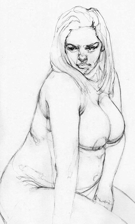
Little Parts Here And There.
I recently moved and as such, the last four months of my life have been comprised of boxes, paperwork, and paint cans, leaving little time to draw. But the new studio is coming together and I'm excited to create in the new space. Until then, I've been trying to create little parts here and there. Here are a few sketches....


Friday, August 09, 2013
Sketchbook: Naegele's Giant Jaguar Skull
Naegele's Giant Jaguar (Ballpoint pen in Moleskine sketchbook, 4x3").


Thursday, August 08, 2013
Sketchbook: She Holds The World In A Paper Cup.
She Holds the World in a Paper Cup (Pencil in Moleskine sketchbook, 4x7"). Study for larger painting.


Sunday, August 04, 2013
Sketchbook: Julie In Walnut Ink Wash.
Julie in Walnut Ink Wash (Walnut ink in Moleskine sketchbook, 5x7").

My wife and I traveled to Los Angeles to visit the Page Museum at the La Brea Tarpits and two art museums: the Los Angeles County Museum of Art and The Getty.
Visiting the Getty may have been one of the most amazing art experiences of my life. I became infatuated with the grounds and the buildings -- wonderfully architect-ed and perched on the hilltop overlooking the city. The gardens below provided a nice interlude between art-filled pavilions.

Their collection was astounding and I felt like a school kid on Christmas morning running from one spectacular painting to another. Many paintings resonated with me and filled me with creative excitement. I walked into a room and was confronted and the master technique of William-Adolphe Bouguereau and his handling of soft edges while still maintaining structured form. I marveled at the details Lawrence Alma-Tadema was able to achieve in his painting, Spring, full of dozens of recognizable figures with heads smaller than quarters. The background was rich but never competed with the foreground. I found myself once again jealous of Sargent's economy, where he could suggest intricate lace with two brushstrokes. And of course, there was the wall of instantly recognizable Rembrandt paintings.
There were several new discoveries as well. I became enamored with a Degas painting where he used an atypically subdued palette and subject matter. I encountered great and whimsical paintings by Hendrick Ter Brugghen and Joseph Ducreux.
I engaged with many other paintings of wildly varying time frames. I had a fantastic time.
We entered a special exhibit titled "The Poetry of Paper." It focused on drawings and ink work where the white space of the paper contributed heavily to the composition and ambiance of the piece. The first work I saw was Giovanni Battista Tiepolo's, Flight Into Egypt:

This work, among many others in the exhibit, was created using chalk and brown ink. I had drawn the picture of Julie (above) in pencil a while ago, but hadn't decided what medium to use for rendering. Feeling inspired by the exhibit, I came home and painted it using brown (Walnut) ink washes. I love ink.
While LACMA's collection is extensive, for some reason I don't connect to the paintings.
The Page Museum was fantastic as well. I went to the University of Colorado where the mascot is a buffalo -- so I'm heavily biased -- but thought the antique bison skeleton was one of the coolest animals there. The saber-toothed tigers were fantastic and I was in awe of the size of the mammoth. There is only one word to describe the way the dire wolves were presented: awesome.


Monday, July 29, 2013
Sketchbook: Jen - Seven Months Pregnant IV.
Jen, Seven Months Pregnant IV (Watercolor in Moleskine sketchbook, 5x7").


Monday, July 22, 2013
Sketchbook: Cheerleader II.
Cheerleader II (Ballpoint pen, watercolor, and acrylic ink in Moleskine sketchbook, 5x8").


Wednesday, July 10, 2013
Sketchbook: Cheerleader.
Cheerleader (Packing tape, ink, and watercolor in Moleskine sketchbook, 5x7").


Saturday, July 06, 2013

Friday, July 05, 2013

Tuesday, June 11, 2013
Saturday, June 08, 2013
Sketchbook: Sheena In Blue Dress.
Sheena in Blue Dress (Casein, watercolor, gesso, and acrylic ink in Moleskine sketchbook, 5x8").

I used Chinese watercolors for the background. The flesh and hair were painted with Casein. For the dress, I applied a thick layer of gesso as a base. I washed over the gesso with blue acrylic ink and then carved back into the ink using an Exacto knife.


Wednesday, June 05, 2013
Sheena Casein Update.
Made some progress on my Sheena casein sketch...
Sheena (Casein and pencil in Moleskine sketchbook, 4 x 6.5").

Sheena (Casein and pencil in Moleskine sketchbook, 4 x 6.5").

Sunday, June 02, 2013
Playing Around With Casein.
The last few weeks I've been focusing on black and white studies -- mostly using Casein. I'm really falling in love with this medium. It's always tough judging values with gouache and Casein because they dry to a different value than when wet so you have to calibrate this shift when painting. But the nice thing about Casein is that if you've judged a value wrong, you can go right back over it with an adjusted value. It dries opaquely and very quickly. With gouache, you're constantly lifting off the previous layer or its being absorbed into the recently applied one so it's a constant that doesn't get resolved. Here are a few recent studies I've done with Casein.
Jen Sitting (Casein and pencil on illustration board, 4x8"). I started this study on a left-over illustration board side-panel I had cut off from a main piece. I hadn't expected to take the study as far as I did so that explains the odd composition. While the figure was painted with pure black and white, I created the background by mixing Shiva Green and Rose Red. It translated into a rich dark color that I really liked.

Sheena (Casein and pencil in Moleskine sketchbook, 4x6.5").

Here's a close-up. Her head is slightly larger than a quarter.

Subscribe to:
Posts (Atom)
