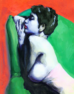
I had a photo-shoot with an amazing model named Julie, and while the session produced many photos that beg to be drawn, I found myself enamored with this pose. I hope to turn it into a large oil painting, but wanted to do a small study first. I find these small studies to be invaluable because they identify problem areas, reveal bad habits, and allow me to figure out how things work in small scale. It provides insight.
Because the photo's high-contrast essentially dissolves into two values with a few, narrow transitional areas, I decided to use a monochromatic approach with an ink-y two-tone feel. I mixed a black using ultramarine blue and burnt sienna. I had tried using Pro White before but didn’t like its off-white color which was noticeable on white illustration board (I found that white gouache worked better). However, since the Moleskine sketchbook paper is yellowed, I decided to give it another try. It worked well. I appreciated its opaqueness, texture, flow, and ability to create interesting effects when mixed with watercolors. Unfortunately, it dries quickly, so the cap has to be put on the jar when not in immediate use.


No comments:
Post a Comment